Scatter plots are powerful visualizations that allow you to explore relationships between two variables in a dataset. Whether you’re analyzing data for business, research, or personal projects, scatter plots can provide valuable insights into patterns, trends, and correlations. In this comprehensive guide, we’ll walk you through the step-by-step process of creating scatter plots in Google Sheets, ensuring that you can effectively visualize and interpret your data.
Understanding Scatter Plots
Before we dive into creating scatter plots, let’s briefly discuss what scatter plots are and why they’re useful:
Scatter plots are graphical representations of data points plotted on a two-dimensional Cartesian coordinate system. Each data point on the plot represents the values of two variables, typically denoted as X and Y. By visualizing the relationship between these variables, scatter plots help identify patterns, trends, and correlations in the data.
Scatter plots are particularly useful for:
- Identifying Relationships: Scatter plots allow you to visually assess the relationship between two variables, such as determining whether there is a positive, negative, or no correlation between them.
- Detecting Outliers: Outliers, or data points that deviate significantly from the rest of the dataset, are easily identifiable on scatter plots. These outliers may represent anomalies or errors in the data that warrant further investigation.
- Exploring Patterns: Scatter plots help reveal patterns or clusters in the data, such as grouping of data points or nonlinear relationships between variables.
Now that we understand the importance of scatter plots, let’s explore how to create them in Google Sheets.
Step-by-Step Guide to Creating Scatter Plots in Google Sheets

Creating scatter plots in Google Sheets is a straightforward process that can be done in a few simple steps:
- Prepare Your Data: Start by organizing your data in Google Sheets with the variables you want to analyze. Each column should represent a different variable, with rows corresponding to individual data points. Ensure that your data is clean, organized, and free of errors or missing values.
- Select Your Data: Click and drag to select the range of data that you want to include in your scatter plot. Be sure to include both the X and Y variables in your selection.
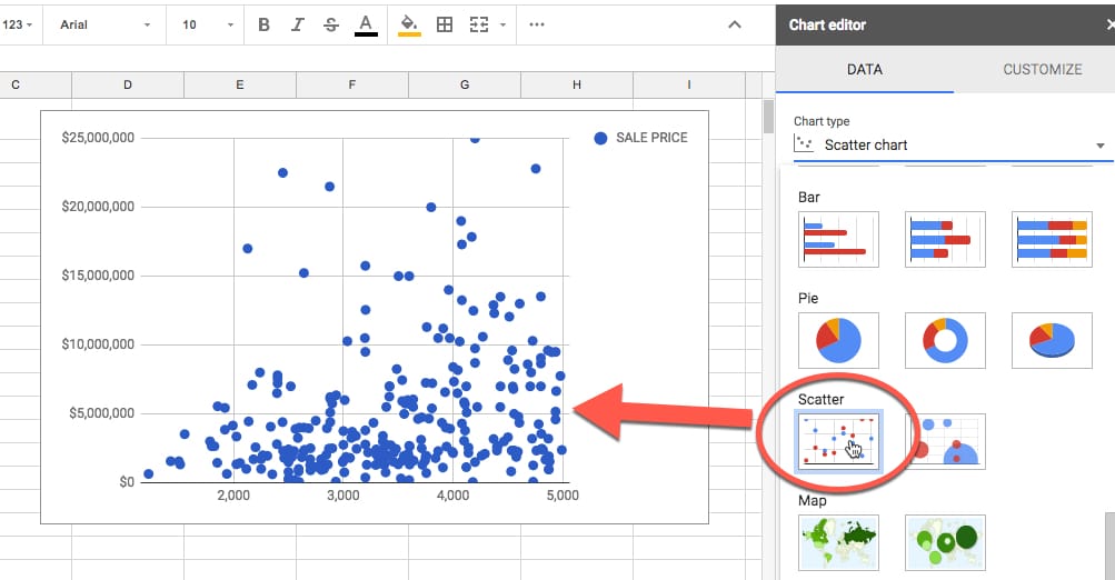
- Insert Chart: Once your data is selected, navigate to the “Insert” menu at the top of the Google Sheets interface. From the dropdown menu, select “Chart” to open the chart editor.
- Choose Chart Type: In the chart editor, click on the “Chart type” dropdown menu to select the type of chart you want to create. Choose “Scatter” from the list of options to create a scatter plot.
- Customize Chart Options: Customize the appearance and layout of your scatter plot using the various options available in the chart editor. You can adjust settings such as the title, axis labels, legend, colors, and markers to make your plot more visually appealing and informative.
- Preview and Insert: Once you’ve customized the chart to your liking, click on the “Insert” button to insert the scatter plot into your Google Sheets document. The scatter plot will appear embedded within the document, allowing you to resize and reposition it as needed.
- Analyze and Interpret: Take a moment to analyze and interpret the scatter plot to gain insights into your data. Look for patterns, trends, or correlations between the variables represented on the plot. You can also add trendlines or regression analysis to further analyze the relationship between the variables.
Advanced Tips and Tricks

Now that you’ve mastered the basics of creating scatter plots in Google Sheets, here are some advanced tips and tricks to enhance your visualization:
- Adding Trendlines: Trendlines are lines that represent the overall trend or pattern in the data. You can add trendlines to your scatter plot to visualize the direction and strength of the relationship between the variables. To add a trendline, click on the three dots in the upper-right corner of the chart and select “Trendline” from the dropdown menu.
- Customizing Marker Styles: You can customize the appearance of the data markers on the scatter plot to differentiate between different groups or categories in your data. Experiment with different marker styles, colors, and sizes to make your plot more visually appealing and informative.
- Using Data Labels: Data labels can provide additional context and information for individual data points on the scatter plot. You can display data labels for each point to show specific values or identifiers associated with the data. To add data labels, click on the three dots in the upper-right corner of the chart and select “Data labels” from the dropdown menu.
- Exploring Additional Options: Google Sheets offers a wide range of additional options and features for customizing your scatter plot. Explore options such as axis scaling, gridlines, error bars, and annotations to further enhance your visualization and analysis.
Conclusion
Creating scatter plots in Google Sheets is a valuable skill that allows you to visualize and analyze relationships between two variables in your data. Whether you’re analyzing sales data, conducting research, or exploring trends in your personal finances, scatter plots offer a powerful tool for gaining insights and making informed decisions.
By following the step-by-step guide and incorporating advanced tips and tricks, you can create scatter plots that are visually appealing, informative, and insightful. Experiment with different settings, customize your plots to suit your needs, and explore additional options to enhance your visualization experience.
With scatter plots at your disposal, you can uncover hidden patterns, identify trends, and make data-driven decisions with confidence in Google Sheets.